| Marketing | Invitations | Logos | Magazines |
| Other Works | Agency865 | City of David | School Assignments |
| Skin Love | DOT Church, Inc. | The Amplifier | Practice Work |
| Marketing | |||
|---|---|---|---|
|
A collection of business card designs for practice and professional work I created over various time periods. The first two pages was my old business card. The background image and back page with the three symbols mirrored my old home page. The next two pages was a practice business card for a fake start-up social media company called Hubal. The third business card was for a former co-worker. She was planning to create her food vendor business focusing on Samoan cuisine. Hence, why she wanted to include the Plumeria Rubra 'Samoan Fluff' (a.k.a., the Tahitian White) flower. The last page was my first business card. 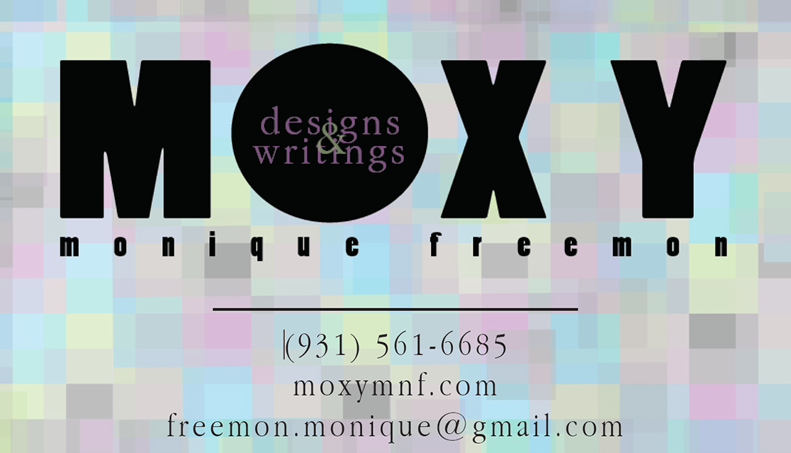 |
A mock-up for a rebranding and marketing assignment focusing on women riders at Harley Davidson. This was part of an assignment for my advertising course during my master's. We were assigned to specifically to create a rebranding plan for Harley Davidson. This was a minor part of the assignment, but I still enjoyed working on this full-page advertisement. I purposefully create the ad to be simplistic to focus on the woman rider. 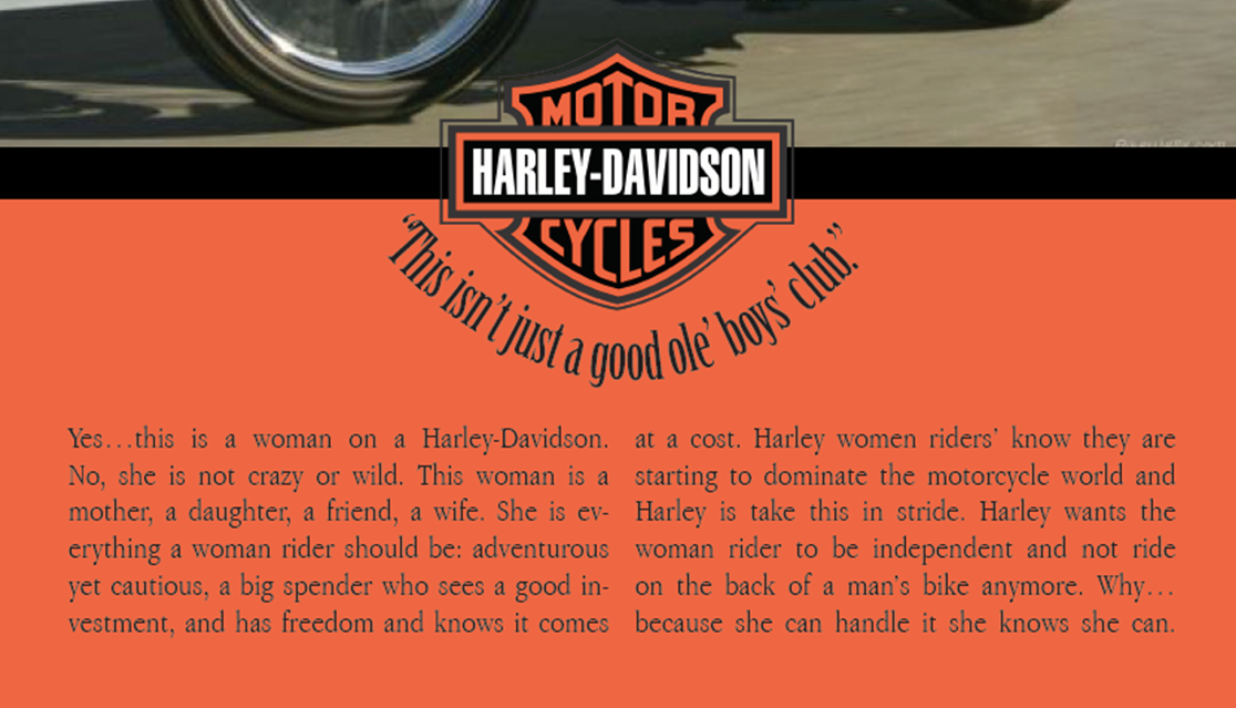 |
A curation of my work as a social media marketing intern at the Wilbur N. Daniel African American Cultural Center. During my intership, I worked with another intern to create various marketing plans for The Center. To create the promotional material, we used Microdoft Publisher since we did not have access to other programs. Also during that time, we create a marketing/ media relations plans (include how to stream) for future interns. 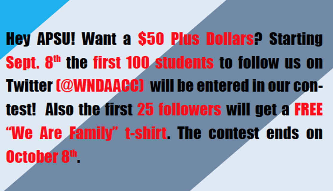 |
No-Lack Automotive was a business in Clarksville, Tennessee that was owner by an ex-member of my parents church. The ad was similar to the Harley advertising. I wanted to make sure the design had consistency with the colors chosen. The colors were chosen to convene integrity, but also have a vintage feeling to the design. The PDF includes a full-page ad, a postcard, banner ad, business card, and two logos I created for the owner to have options. Unfortunately, the owner moved. 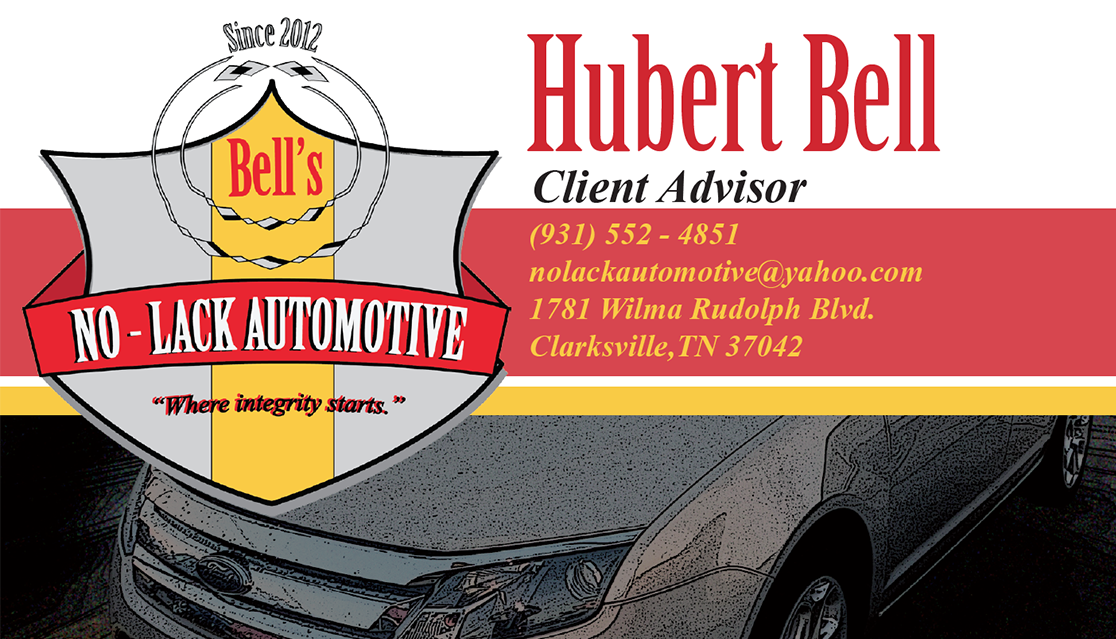 |
|
I oversaw the design for the flyer and brochure to be disseminated at the event. I ended up designing both materials. However, we needed to collaborate with another department's student intern, so I had them create the cutouts. I wanted the brochure to turn into a poster once the attendees opened it.  |
|||
| Invitations | |||
|
This was an invitation I created for a former co-worker who was having a girl. During that time period, I was continuing to refresh my design skills by making invitations for co-workers who were having parties and get-to-getters. The only thing not created by hand was the baby. The baby was a PNG I found on Google Images. The flowers where my favorite part to design. I purposefully used pastels to portray a soft, delicate meaning of what a baby shower is suppose to represent.  |
A former co-worker wanted a custom invite for her 25+ party she was hosting with another friend. As per our conversation, she want the invite to look sexy and for grown people. I wanted to include a martini glass pouring out red liquid to represent adulthood, elegance, but also sexiness in the form of self-confidence. (FYI: I was not invited because of the age limit. Haha!) 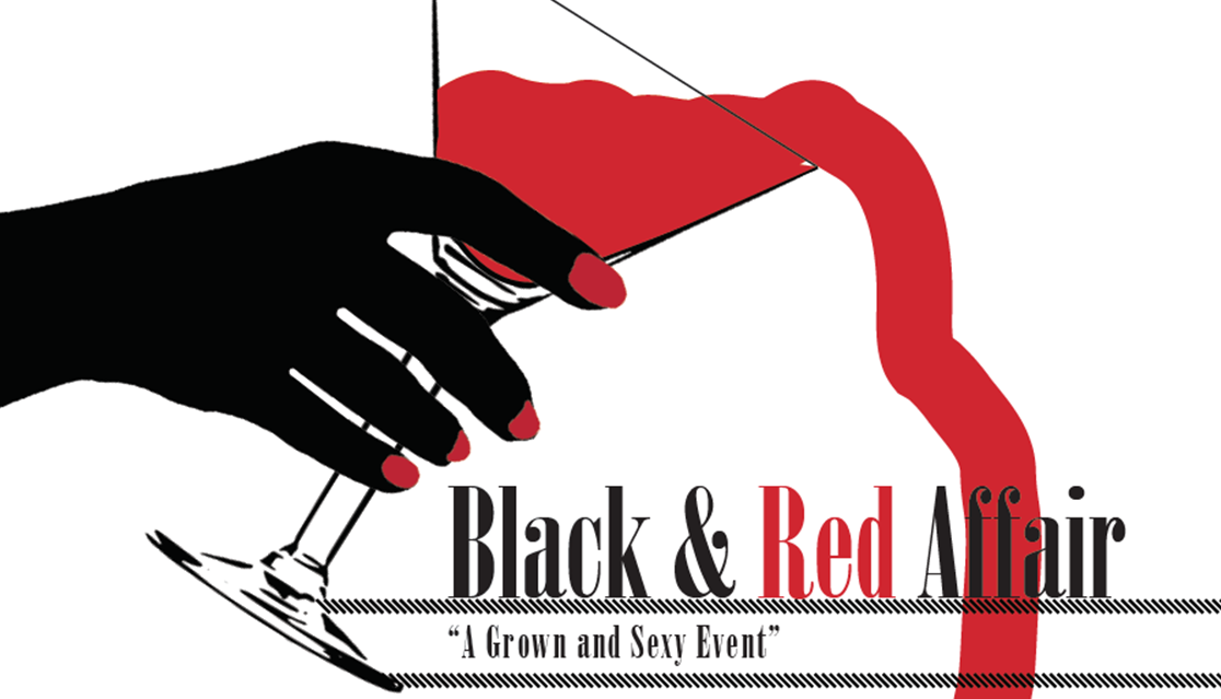 |
A co-worker wanted me to create an invite for her housewarming party she was hosting. She wanted it to be simple, but for adults. My former co-worker loves wine, hence why I wanted to include a wine bottle and glass. I choose muted colors to represent a calming vibe where people would feel relaxed at her place. For the wine color, I used the color picker from a photo I found on Google Images. Most of the colors I use within my designs are from different images instead of the swatches provided in Adobe programs.  |
|
| Logos | |||
|
I created a logo for an information science conference in Lyon, France. The prompt for the contest wanted the designer to create a logo representing the four schools included in the conference. I isolated the main color from each schools website and placed them into a large square. It the square represented their individual personalities, but also how they collaborated with each other. The tree portrays knowledge, family, and connection. I also provided screenshots of how the logo was used on BOBCATSSS promotional materials. 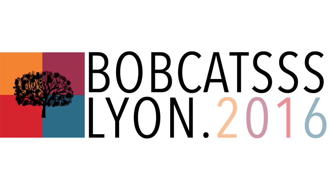 |
A custom hand drawn logo representing my sister’s friend’s taco business. He gave me creative freedom, but stated something to fit his personality. I created two logos. The first is oart of a trend I noticed with upcoming food businesses, the use of bold letters. The thickness of the characters represents bold flavors and personality. The second logo character thickness convened a more subtle and comforting feeling of Goody's restaurant. The food items was handdrawn by me to spell-out the name "GOODY." The spacing between the food items reflected the spacing of the top characters. 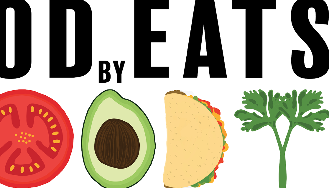 |
My parents church commissioned a logo for their daycare center called Priceless Jewels Academy. There was many ideas the clients had, hence, I created multiple logos to give them an idea of what could be possible. This enable them to have a visual and tell me what they liked or disliked. After a few meetings and emails, we figured what would work best. The church wanted a logo that was playful, but illuminate that the daycare's purpose was to help children grow and thrive in life. The colors I choose we various pastels and muted colors. 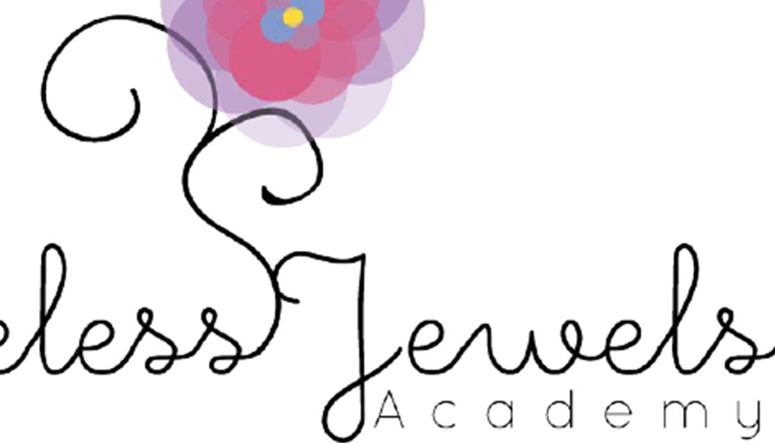 |
A mock-up logo design for an assignment representing a time travel company for my graphic design course. In this course, I was an instructor for two graphic design courses. The two logos within this file were examples I wanted to show the students to have a visual idea of how they could be creative. The purpose was to demonstrate logos should be simple, but have meaning in every decision made to create it (like any other design). The colors I selected were mainly primary colors to represent people are allowed to understand the beginning of time. The gradient represented how people can fade in and out of history. 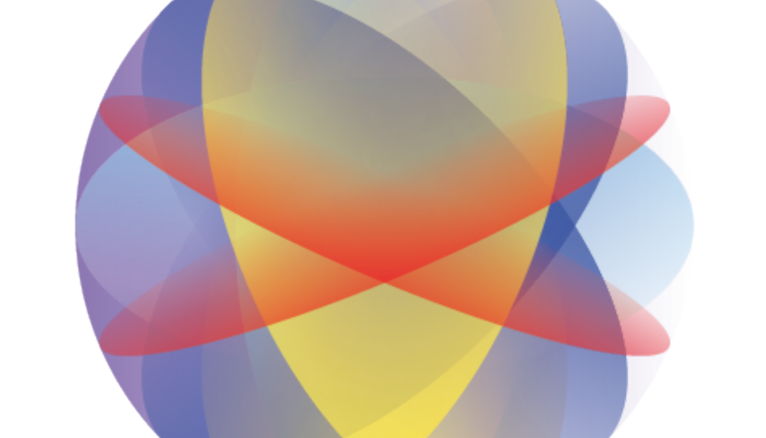 |
|
This was the original logo for my first personal website. However, there are multiple logos in this file. Many of them were practice logos or for assignments from when I started using Adobe programs. The fourth logo is actually a GIF I created for my first personal website, same as the fifth (third redesign) and the sixth (second redesign). As you can see, each logo represents me growing as a designer. The first logo was to practice inserting a photo within text and the second deals included me using Photoshop.  |
|||
| Magazine Layouts | |||
|
This is a mock-up design for a travel magazine layout assignment I created for my graphic design course. The purpose of this assignment was to get students familiar with magazine layout design, colors, photography, effects, links, Adobe Acrobat, InDesign functions, and effects. Students were allowed to choose their dream destination and only use photos for their design.  |
This was a practice design to refresh my layout skills with ID for no particular reason. I was imaging a story about address issues with coffee production. I wanted to practice with the pencil tool in Indesign as well as play with typography for the heading. The colors were taking from the dominant photo featured in this spread. 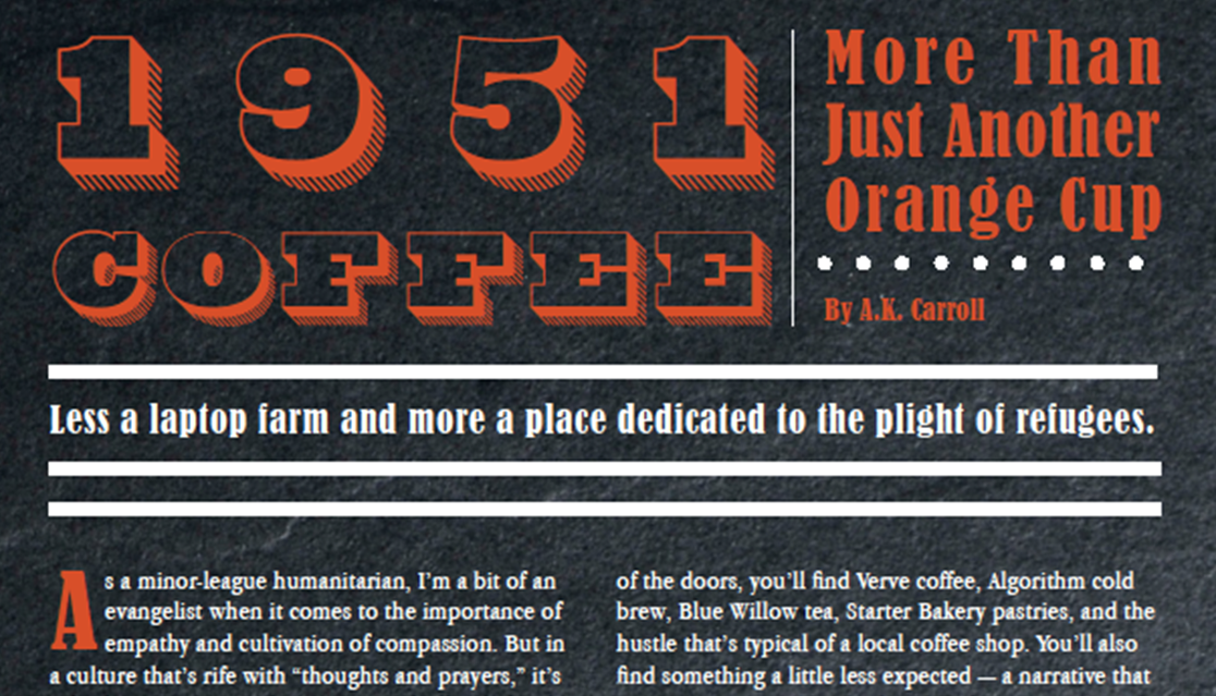 |
A curation of my layout designs for INSPIRER magazine as an intern turned writer/designer. I was a books/culture writer for the international magazine. However, there was one month when the staff would needed help with layout design. So, I volunteered to help them. This was when I was starting to really dig into InDesign (However, now, I would make a few changes.). My favorite spread was "The Great Gatsby" spread. I took inspiration from the book cover and the skyline in NYC. The Statue of Liberty was hand draw as well.  |
A multicultural women’s magazine focusing on various fields such as politics, non-profit work, science, sports, and pop culture. I crowdsourced for writers who had autonomy to write their story with minimal direction. I acted as the editor-in-chief and sole graphic designer for the publication. Additionally, I wrote a few long-form feature articles (as per requirement from my committee). We went through many editing sessions via email, which worked smoothly. The name "MOXY" means having guts or gall to do something different and create change on a global scale. 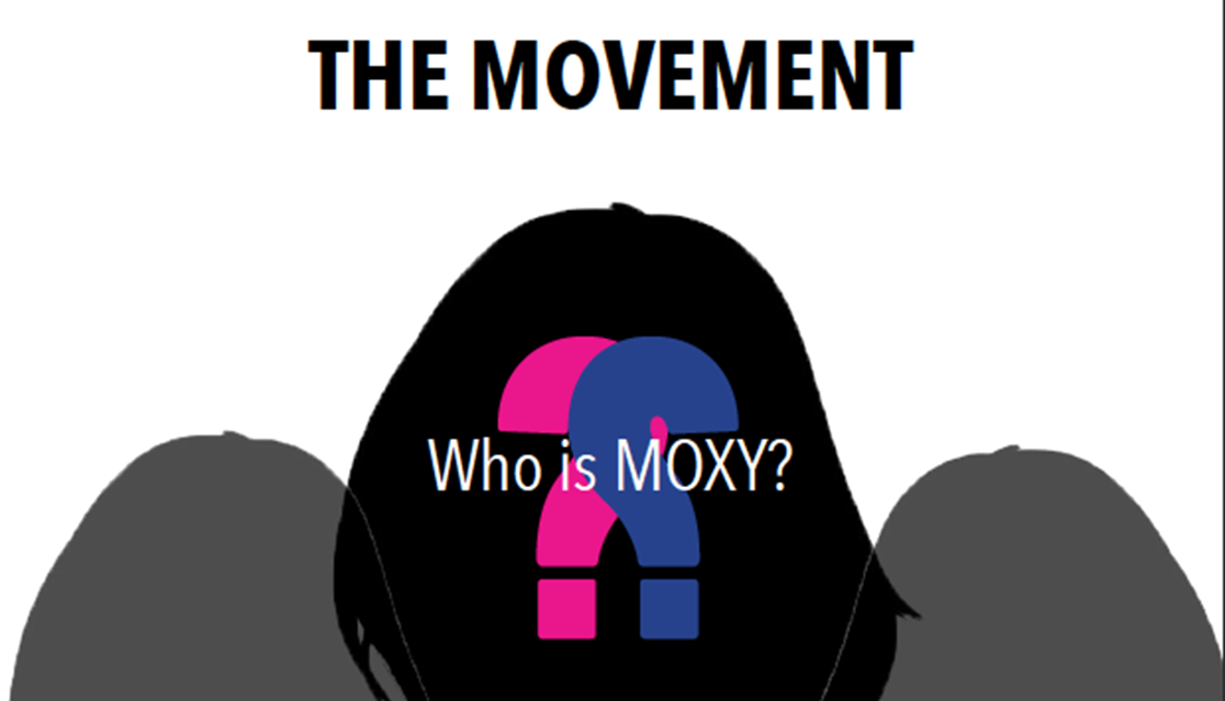 |
|
Not About Fries was some practice work to refresh my skills in ID and color theory. It was originally suppose to be a practice assignment for my students. I specifically wanted to focus on gradients, the pen tool, and shapes. The top photo was from a book cover I was reading, the middle photo was shot by me, and the bottom photo was found on Google Images.  |
A layout design to practice using ID functions and design composition. A couple years back, I was a TA for a magazine production course at UTK. The purpose of this design was to teach students how to create a magazine layout. I wanted to create a simple two-page spread (which would part of a larger spread) for students to not get overwhelmed with InDesign (for many it was their first time).  |
I created a fashion and cultural magazine for a desktop publishing course during my undergrad. I was part of an assignment to create a 16-page spread magazine. The magazine focused solely on fashion and the images I do not claim. This was actually the beginning of my journey to create MOXY magazine, my final masters project to graduate.  |
I oversaw the design of the publication for SCOOP's Spring 2017 issue when I was a TA for a magazine production course. I was leading a design team about of five women (a few more students started to design too). We had weekly meetings to to discuss the elements of magazine layout design and timelines. Then I would edit their page layouts multiple times to ensure their pages are up to design standards. I specifically designed pages 10-11, 18-21, and 24.  |
| Practice Work | |||
|
I was playing around with typography, PS and AI. I wanted to play around with quotes. My favorite one is from Coco Chanel, "Fashion fades, only style remains the same." As I have gotten older, I realize how much trends can and following them can be detrimental to society on a economic, environmental, and social field. My style use to be bold colors and crazy styles. I never really followed the trends in high school, college, or now. I would describe my style is casual, chic, and classic. Hence, while Chanel's words is still one of my favorite quotes. This also describes my design style as well. I do intend to create trends nor follow them. 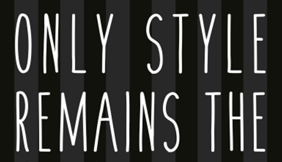 |
I was practicing with type and color for an ad in ID. My favorite time period USE to be the 1950s and 1940s... USED to be. I created this projects to create a Coke advertisement for a U.S. holiday.  |
This was an experimental yearbook cover for The Monocle when I was on the yearbook staff. My thought process was considering what college (at all levels) is similar to a crossroads moment. Form choosing a major to dropping out to going to grad school. Each decision will direct you to another path, whether it is prosperous or fruitless. Nonetheless, it is a decision you make and it is an intense one. I wanted to make the cover standout form a typical YB cover and represent the transition to becoming a young adult. 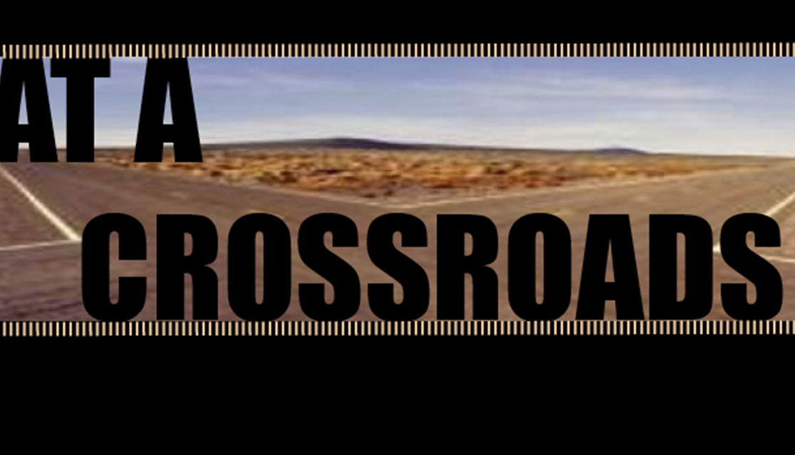 |
I wanted to experiment with color theory, effects, and shapes, particularly with layering red and blue to create a 3D effect. Then I added a grainy effect to reference the white noise many scifi films create when an alien is attempting to communicate with Earth. 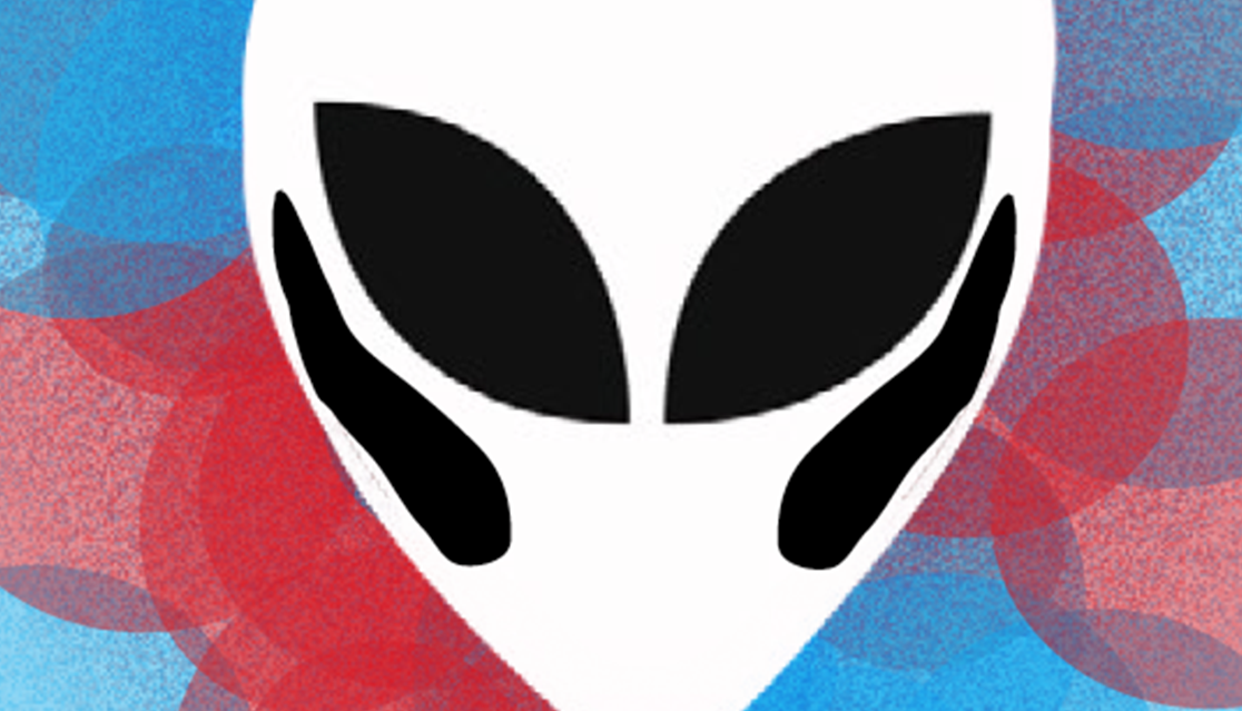 |
|
An experiment with digital art that is darker, more gothic in time for Halloween. This image is a mixture of images and the brush tool in PS. For the bags, I cut the eyebrow and repeated it for the eye bags. The image is supposed to be unnerving. 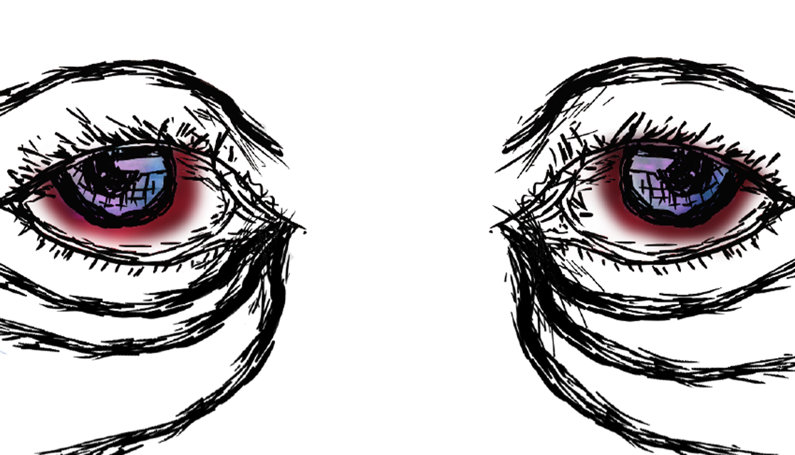 |
I created a movie poster for a fake drama about a neurosurgeon who goes on a self discovery journey after he loses the love of his life. I wanted to place an emphasis on the color blue both muted and vibrant. 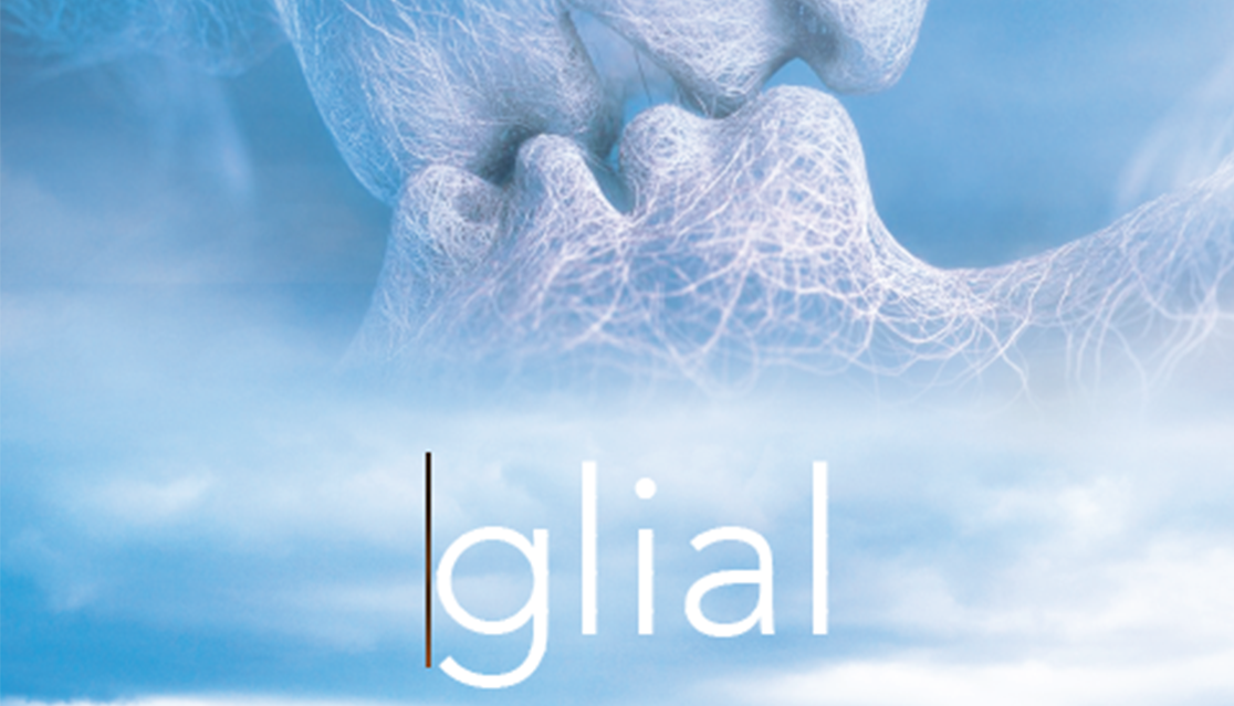 |
I wanted to create a composite image of another alien-like world. This image was created from four images in PS. 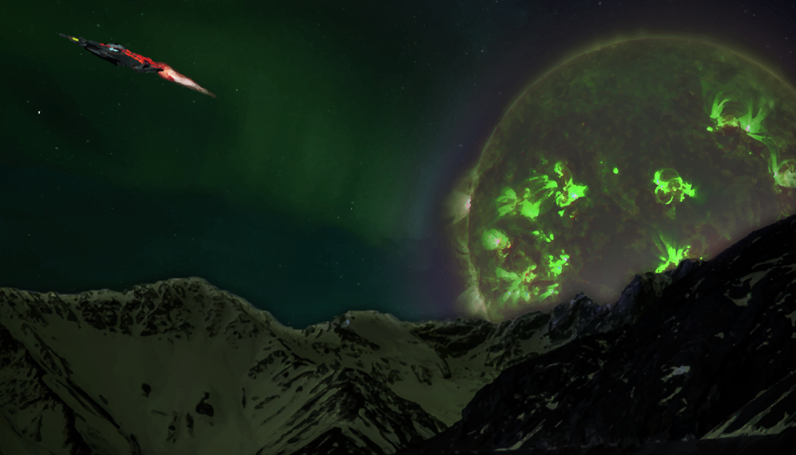 |
I was playing around with type,layout, and the color orange. During that time, I was obsessed with sunsets. My favorite part of a sunset is the soft orange. I want to convene the warmth of a sunset. Additionally, I found a poem online that is an extension fo the design I want to create. The layout was created in ID. 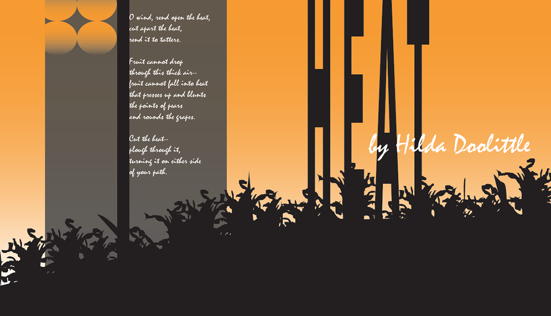 |
|
I created a digital piece to practice creating a composite photo of another planet. This is similar to the Green Planet composite image. I am obsessed with otherworld dreamscapes. I chose various shades of blues, pinks, and black. This image was created in PS and Ai. 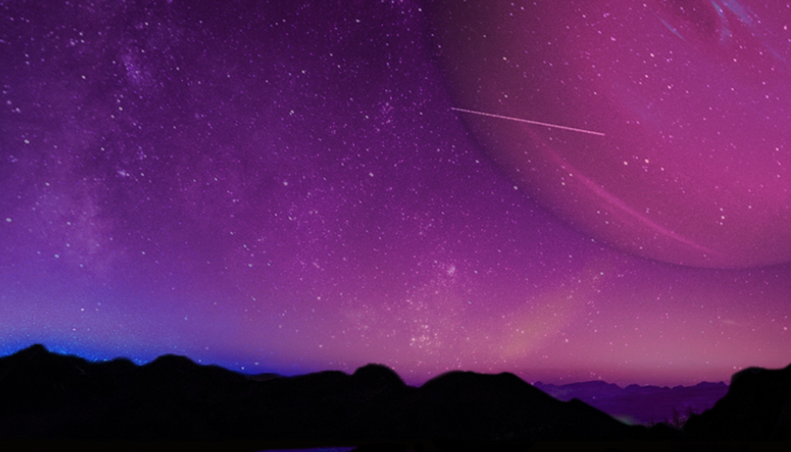 |
I was practicing with ID and AI to create a movie poster. I wanted to use bold and bright colors for this poster. I wanted to practice with color, type, and composition. I wanted to use yellow because it can sometimes be a difficult color to use (also not my favorite color). It was supposed to be a indie film poster. Also, the name on the poster is spelled correctly.  |
I wanted to practice creating a CD cover of an alternative rock band. This was inspired by an assignment I did for my desktop publishing course. The colors and the band was suppose to be a youngish band similar to Coldplay (Yes! I have loved them since I was a kid.)  |
A composite image of the sky composed of six photos created in AI and PS. This is one of my favorite composite images I made. Actually, it was the last one I created (Green Space and Neptune Night where before). The images were cutout and placed together in PS. Then I did a Livetrace in Ai to change the image from bitmap to vector.  |
|
After watching Coldplay’s Ghost Stories Live 2014 performance on Youtube, I wanted to create this image. I was interested in practicing with typography, color, and images in PS. My favorite part of this image is the type I found on Dafonts. It is one of my go-to websites to find fonts for free and to be creative.  |
I was experimenting with the ID the effects function when I was starting to dive deep into ID. THe photo was form a photography course I was taking att APSU.The colors featured were from the image itself.  |
I was refreshing my ID skills, typography, color theory and white space. As I began diving deep into design, I noticed I lacked appreciating white space. I used to think every space should be filled with something, however, I started to understand the benefits of white space in design. I used an image from a flower and broke it into several pieces. 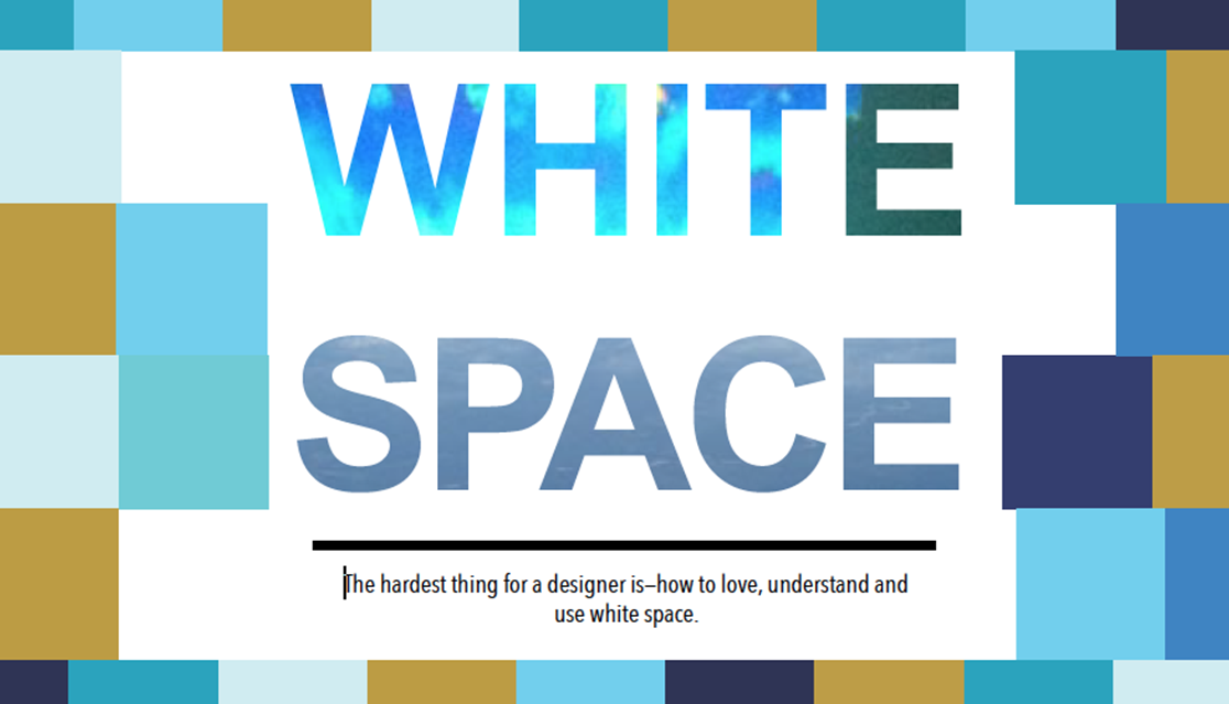 |
This was an assignment focusing on minimalist movie poster design for a course I taught at UTK. I wanted the student to create a minimalist movie poster. It was a good path to teach them design, but how to work with basic shapes, colors, but create a aesthetically pleasing poster. I wanted them to focus on the main parts of the poster itself. I created multiple versions of this movie poster.  |
| School Assignments | |||
|
I created a minimalist design for Melissa de la Cruz’s Blue Bloods series as part of my assignment for an art course I took in undergrad. The book cover was created with PS. I specifically focused on the angel wings, blues eyes, and the NYC skyline, which all three are critical to the series. 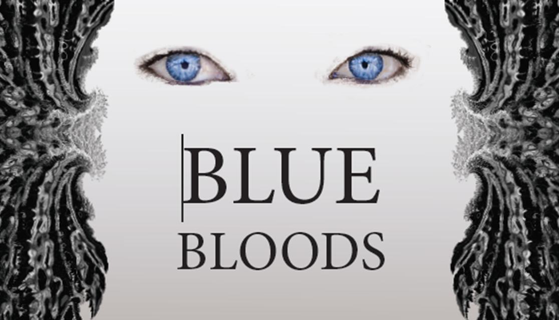 |
My classmates and I created a media relations plans for Sumner County CASA during undergrad. It was a semester long project where we worked with a non-profit to help them with marketing, promoion, advertisement, media, etc. Anything that dealt with design or creating promotional materials was my job. For our final presentation, I created a mock-up t-shirt, hat, and tote (hand-painted). 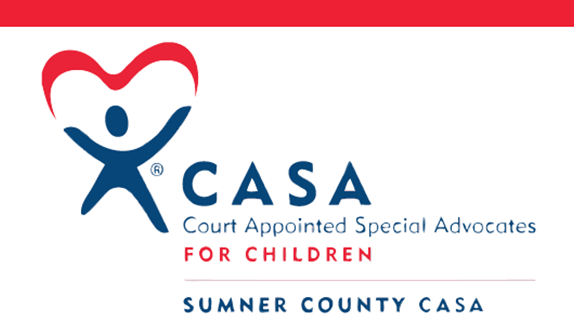 |
During my undergraduate education, a few of my classmates and I created a press kit for a fake corporation called Connect the Dots. It was part of a business course and were had to create a media kit. We were only supposed to create the copy, but I wanted to create a mock-up of a press kit and have it binded. According to our teacher, this increased our grade. 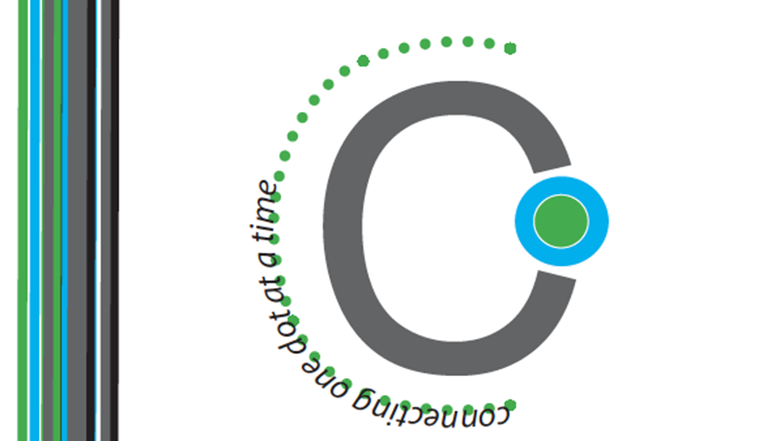 |
For my desktop publishing course, we wre assigned to create a brochure for a time travel company called Chronos. We had to create original copy and design. I utilized gradients and muted colors for the cover to show the seriousness of time travel and to convene space/technology. The inside included more colors and images of where a person could visit. Then I wanted to create a device to show how people could travel. Another student suggested creating a "Ziggy" (and also explained it to me). 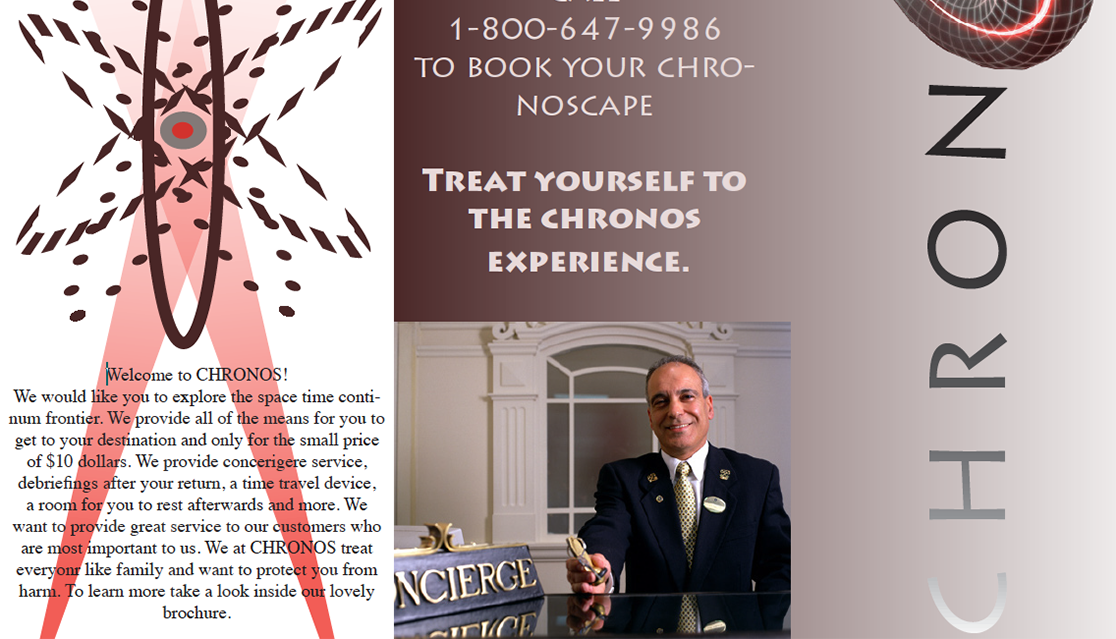 |
|
The scream collage is a mixed media image of a person who hates math. It was my first assignment for any of my art courses. 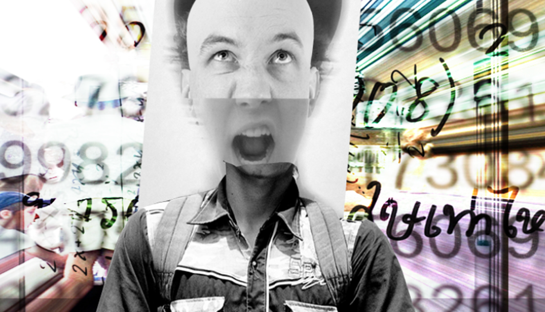 |
My art professor instructed the students to create a vector image of an object and make it our own. I decided to design a Dr. Marten shoe (on of my favorite boots). 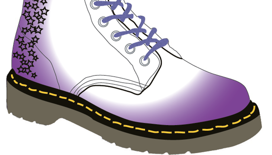 |
A curation of a business card, CD cover and banner ad for a desktop publishing. The colors of the CD cover was inspired by Coldplay's XY album. 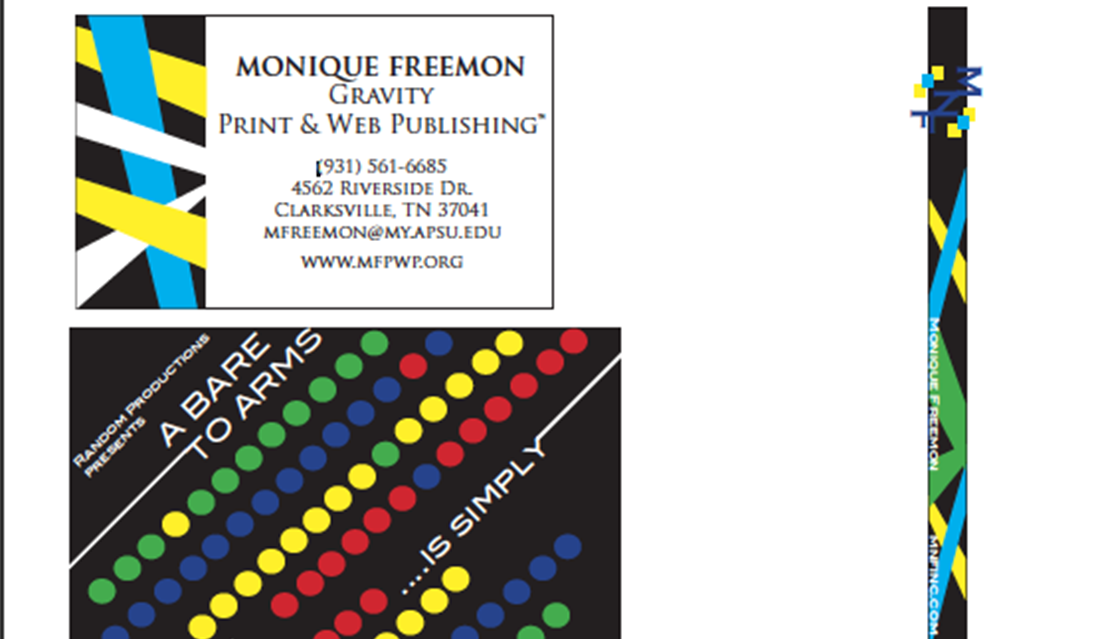 |
The assignment was called Momentos & Elumentions. My art professor for graphic design asked us to create a mixed media assignment inspired by Alice in Wonderland (others chose a different artist). I wanted to combine my love od sketching/fashion design and graphic design. The threads were added with a scanner. While the spools were being scanned, I was moving them around to distort them. 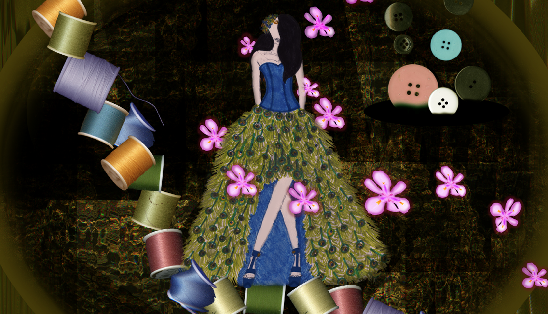 |
|
I created an abstract image of The Scream for an art course. We were assigned to choose a famous painting. Then we were instructed to create an abstract art from that piece using only blocks. 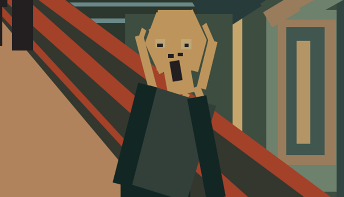 |
This was an image created in PS focused on a 3D space and textures. For an art assignment, were were instructed to create an 3D world. I wanted to create a technological dystopian space. 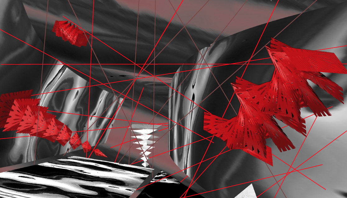 |
I created a typography image as part of an art assignment for an art course. We were instructed to transform an image we took to a typographic image. I chose an image I took during my first time at Disney World. While most of the image is made of random words, the face represented the amount a Disney worker get paid to work at the park. 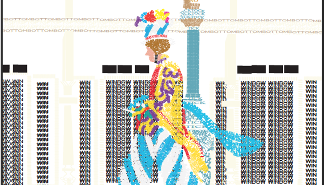 |
|
| Other Works | |||
|
I created a digital poster to present my dissertation at the 2019 Broadcast Education Association convention in Las vegas, NV. I was presenting with others in the great conference hall located in the Westgate Hotel. The design and content was created by me with original illustrations. I choose these colors because they are complimentary, capture the eye, and readability purposes. 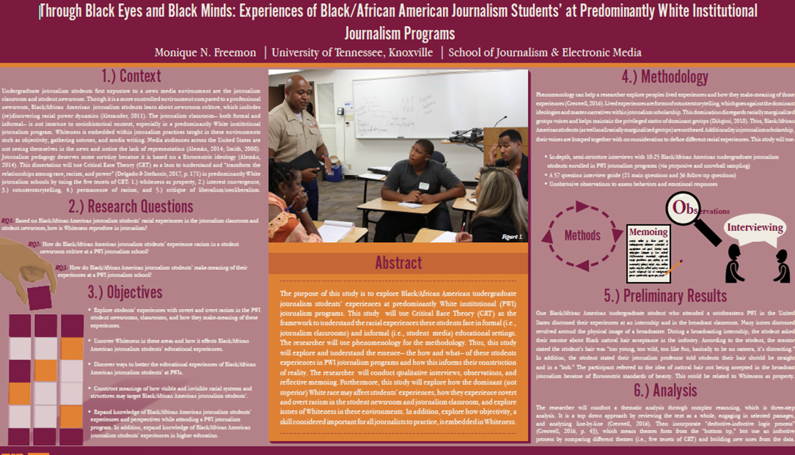 |
I was commission to create a flyer for a women’s conference for my sister's friend. I wanted to keep the design contemporary yet serious. At the conference (I was also the photographer.), many women shared their experiences to help with growth, spiritual connectedness, health, etc. I choose neutral colors and hot pink (representing women) to make it pop.  |
I created a poster as part of my cultural studies service work for my CS course. We had to choose a service project. I choose making an account for Black women at UTK (now deleted because I don't attend UTK anymore). I choose Black to represent Black women's skin, but I also wanted to emphasize the figure's hair. Many Black women are told their hair is not beautiful. Well, that's a lie and I wanted to show them their hair is wonderful, hence the flowers. 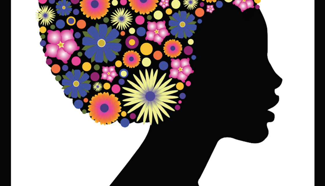 |
I entered a contest of Talenthouse for design a t-shirt for Coldplay. They provided the images above the monkey (created by me). I choose to create a monkey because of Coldplay's music video Adventure of a Lifetime were they were transformed into chimpanzees. The headphones and the cloud of images represents what if feels like to listen to Coldplay songs. 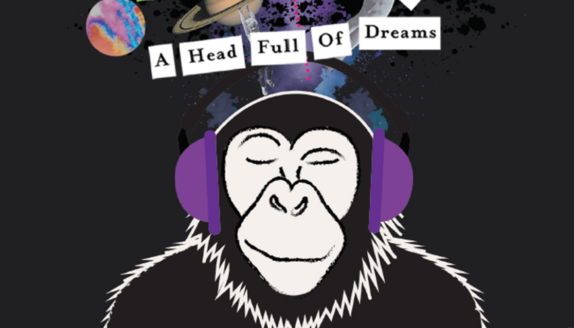 |
|
My sister needed help to create an alternative book cover for an assignment in her graduate course. They were suppose to recreate a cover of their favorite book. I used a silhouette image of Cinderella's at Disney World. Then I used a separate silhouette image of Walk Disney and Mickey Mouse. For the stars, I applied an outer glow on the stars close to Walt and Mickey, then decreased the size. I wanted to create a perspective technique.  |
A friend and former classmate asked for me to create an image for her drug addiction project. She wrote a long-form feature article for her master's project about babies born of parents with drug addiction (in addition to creating a video). The first image is just a baby I sketched in a crib, the second is a baby bottle being injected with a reddish/brown liquid representing to toxic effects of drug addiction of babies who unknowingly consume what is given to them. Third image is a smilar explanation. 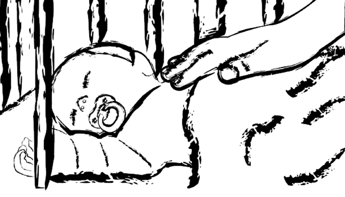 |
Part of a gift I create for a friend. I bought a shadow box, fake green leaves and flowers, hot glue, and white lights (glued them to the top of the box to light up the box itself at night). This image was use as a background. It waas created in PS from two images. I wanted a natural, earthy feeling with green tones.  |
It was part of a gift I create for a friend. I wanted a relax, calming feeling with blue tones. Similar to the Earth image. I used real sand and seashells. 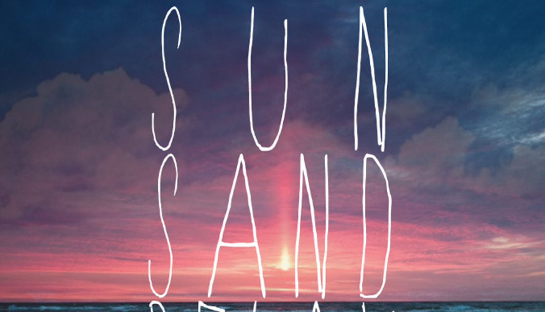 |
|
I created an interactive graphic which addressed suicide prevention for the Tennessee Suicide Prevention Network. I was a volunteer for TSPN as a form of service. I was searching for a non-profit to use my design skills to help others.I was given multiple stories of people who dealt with mental illness and suicide. I copied edited only for misspellings and grammar (e.g., mainly commas) because I didn't want to damage the integrity of their stories. One person sent a video, which is why I create a link to that site. The final product is a mixture of PS, ID, and AI.  |
My advisor asked me to create an infographic of Ida B. Wells-Barnett’s life. She wrote a book about the great civil rights activist/leader's life and wanted an infographic to open her book. I used the color purple from Wells-Barnett's background image (an it represents royalty) and the gold as a complementary color. 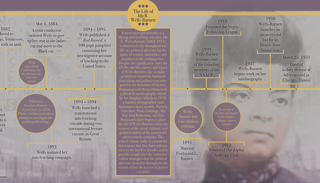 |
This graphic was part of a Talenthouse competition to thank creativity. For many artist, creativity can be used for many reasons in many forms. Sometimes creativity can be therapeutic. This is why I showed a personification of creativity hugging a human. 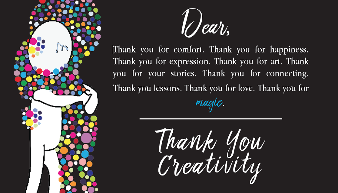 |
I entered a Talenthouse competition to design a poster for Wimbledon. We were instructed to create a poster celebrating the spirit of Wimbledon. 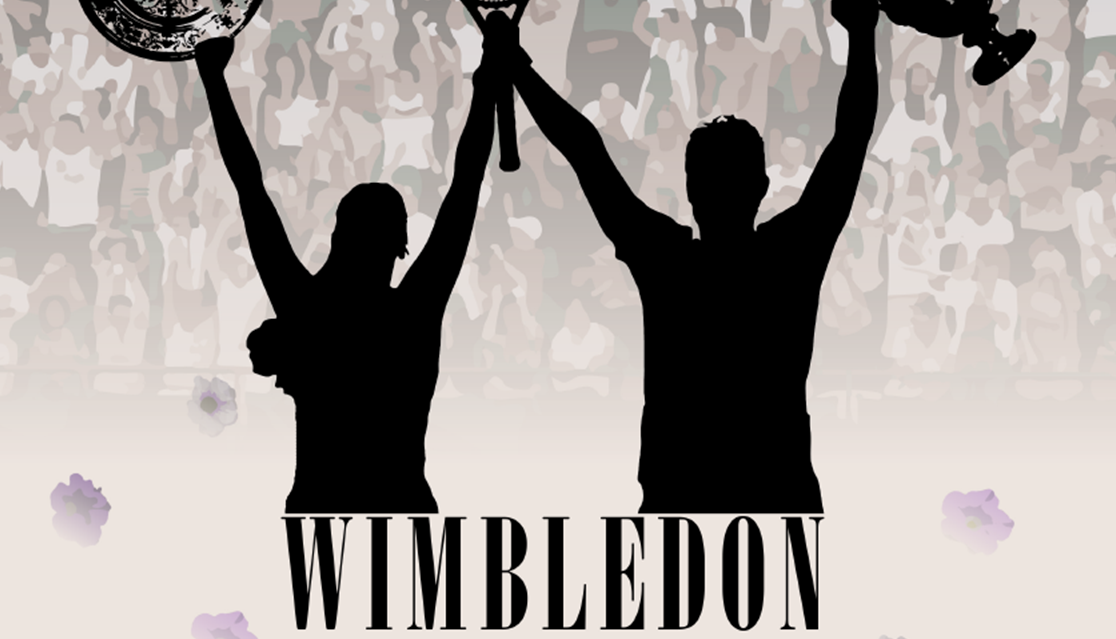 |
| Skin Love | |||
|
The first two logos were the original designs for Skin Love. It was a surprise for a friend. The third image is the redesign logo I created (about 5 years apart) after she asked me to create a logo for her website. |
|||
|
This advertisement was created for a friend who was thinking about starting a skin care business. I chose green as the dominant color to represent peace, sustainability, self-care. As well as it is a cool color, which eases the brain. The image was a a combination of InDesign and Illustrator. 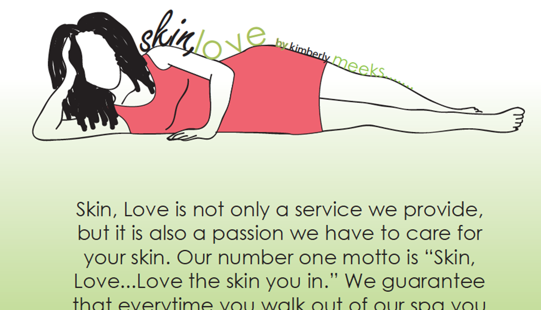 |
This was the first logo I created. The reason for the color scheme is similar to the advertisement, green as the dominant color pair with neutrals for a calming message and effect on the brain. 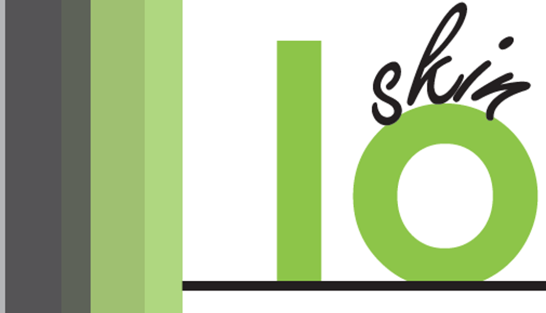 |
This was the second logo I created for Skin Love. It was strictly created in Illustrator. This revamp occurred after I gained more experience with Adobe CC. I decided to keep the same color scheme of cool colors, but include more blues as well to convey a message of connecting skin care to self-care and peacefulness. I found an image online just for the outline of the body, but then made it my own. I only used it for tracing. 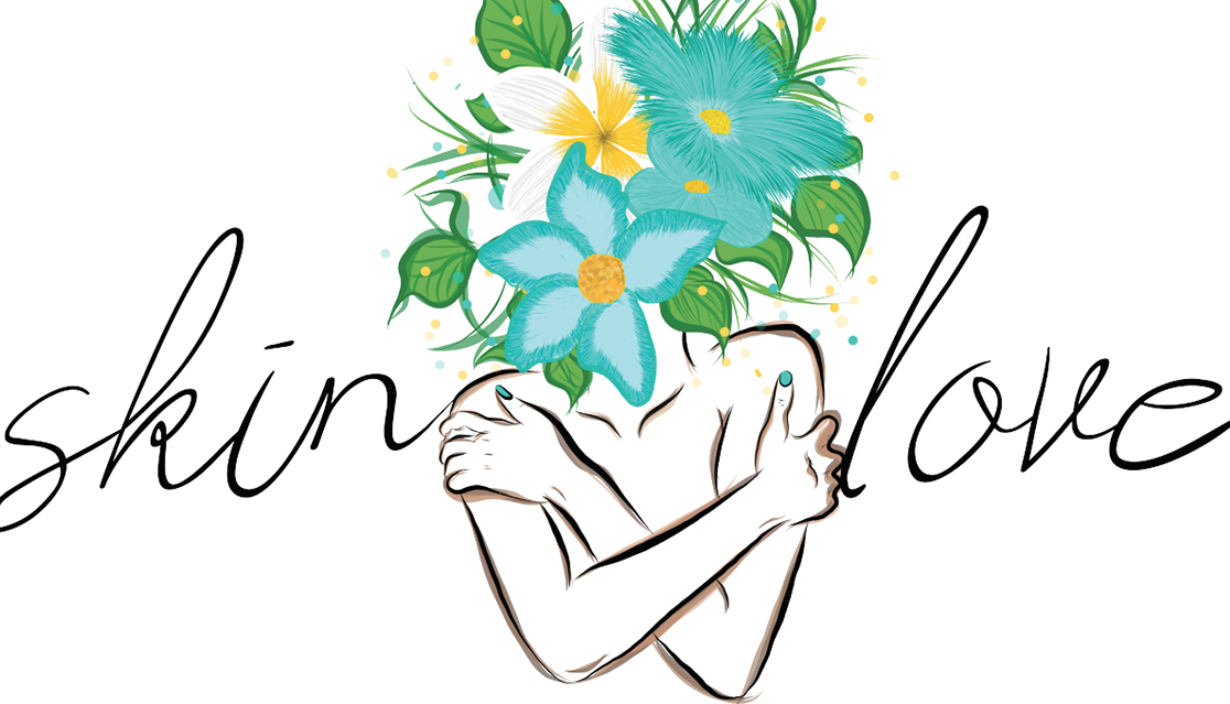 |
|
| Agency865 | |||
|
During my doctoral studies, I was commissioned to create marketing materials for the communication departments upcoming media agency. Originally, the goal was to create a brochure, logo and deckslide. I ended creating a full media kit, brochure, two logos, and a deckslide. |
|||
|
The slide deck was created as part of a presentation with the brochure and media kit. 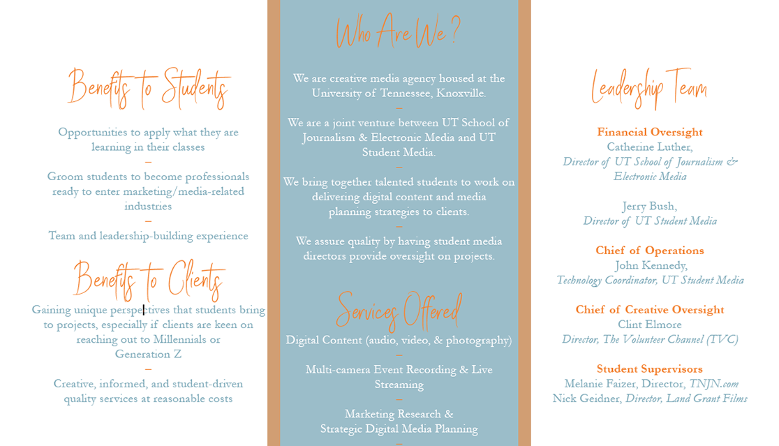 |
This was the second logo I created for the clients. I continued the kaleidoscope, but within the character. I made the colors more muted to give an old school 80s feel to it. This was the logo the group selected. |
I created a media kit in conjunction with the other marketing materials. I was provided with the copy and some of the images to create a kit to provide more information about the agency.  |
This brochure was a condensed versions of the media kit, but still informative. I wanted to brochure to have a contemporary, but light-hearted look. |
|
This was the first logo I created for the clients in the shape of a kaleidoscope. The kaleidoscope represented diversity in the types of media available. |
|||
| The Amplifier | |||
|
Working at The Amp was originally my service learning project for a culture studies course. However, I became the main designer and occasional writer for the publication. |
|||
|
I collaborated with another designer to redesign The Amplifier's layout. I was asked by the head of my journalism program to help out the publication who needed a graphic designer. I then used it as part of my service project, which eventually turned into a permanent service position until the publication folded. We agreed on standard fonts. columns, cutlines, headlines, pullout quotes, images specifications, and specific elements for the future publications. We stuck with black and white colors to emphasize the yellow in the logo. 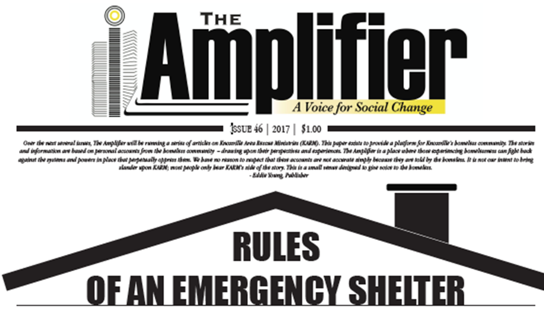 |
I was the sole designer for this issue. This was the original draft. However, a new managing editor came in during production and did not like the design and changed the featured stories. I also wrote a story for this issues and helped with copyediting. The purpose of this design was to celebrate the continuation for The Amp, which has been struggling for a few years to continue publishing. 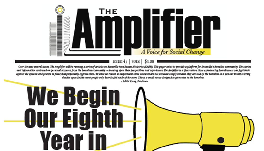 |
I was the sole designer for this issue. This was the final design for the publication. 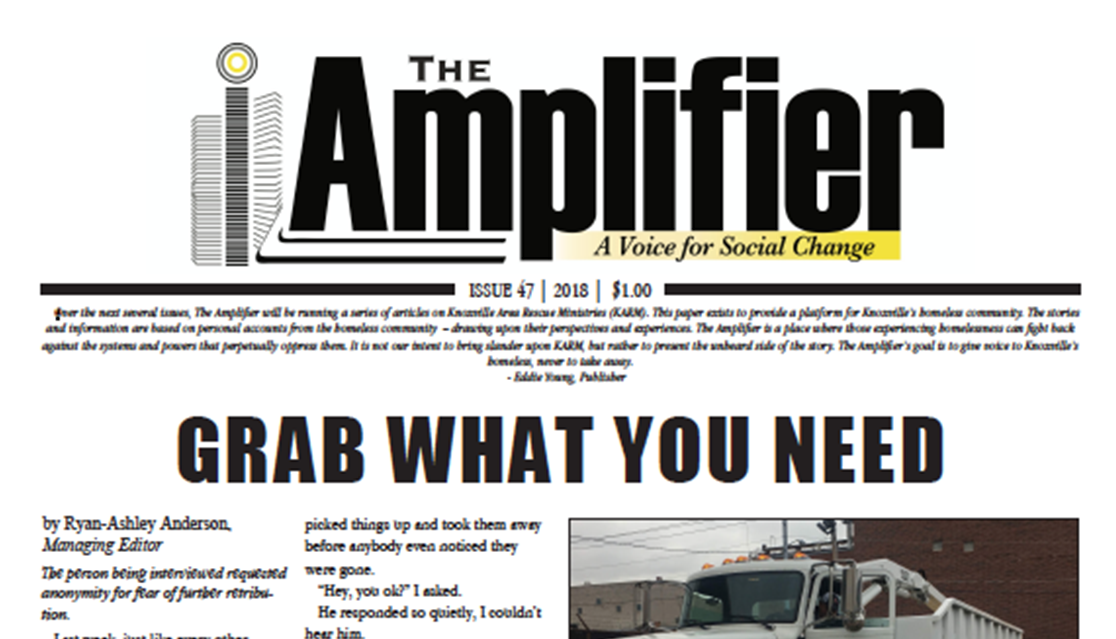 |
I was commissioned to create a logo for the Chattanooga Amplifier. The publisher wanted to create a sister publication in Chattanooga. I design two logo based on one of the city's famous spots called Lookout Mountain (a.k.a., "See Seven States"). One image has the state names and miles. The other doesn't. Unfortunately, the paper never started publishing. However, the publisher loved the logos. 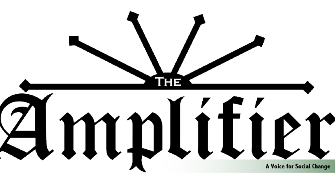 |
| City of David [COD] | |||
|
I created a promotional flyer for my sister's church’s concert. I choose shades of blues and purples to create a calming and serene effect. I used a silhouette of a city to reflect the church name and multiple images of overlapping clouds to reflect spirituality.  |
I created a promotional flyer for my sister's church’s concert. I choose shades of blues and purples to create a calming and serene effect. I used a silhouette of a city to reflect the church name and multiple images of overlapping clouds to reflect spirituality.  |
I created a promotional flyer for my sister's church’s concert. I choose shades of yellow to create a celebrating effect. The image on the top reflects sparklers and fireworks. I wanted to keep the design nice and simple. 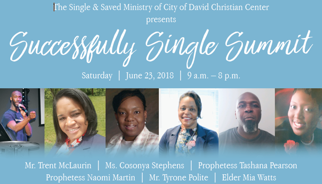 |
I was asked by my sister to create a flyer for COD’s women’s conference. The main colors I wanted to utilized was soft/muted pinks (represent femininity) and browns (represent Black women). I wanted to keep the visual soft and light, also reflecting a peaceful and supporting atmosphere. 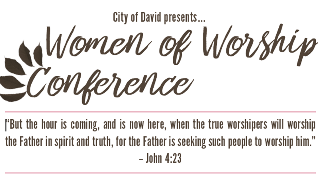 |
| Deliverance Outreach Temple Church, Inc. [ DOT ] | |||
|
I created a flyer for DOT’s annual Candlelight/Christmas Eve service. The purpose of the service to remembrance the birth of Christ and to remember the meaning of Christmas. 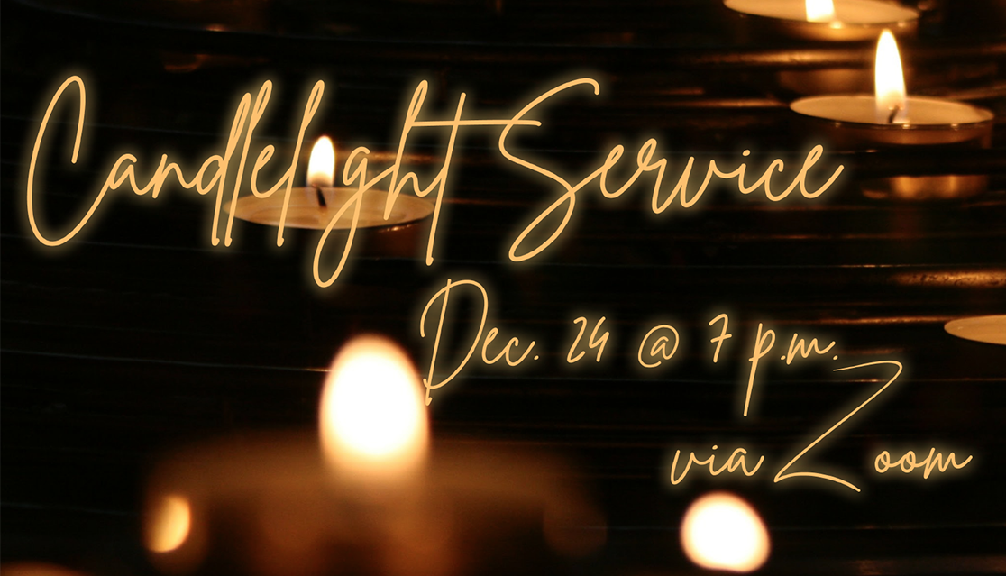 |
This is DOT’s dinner menu for their 20th Pastor's anniversary. DOT's colors are burgundy and cream. I decided to make the menu nice, elegant, and simple. The images featured are included in the menu. The document was created in InDesign. 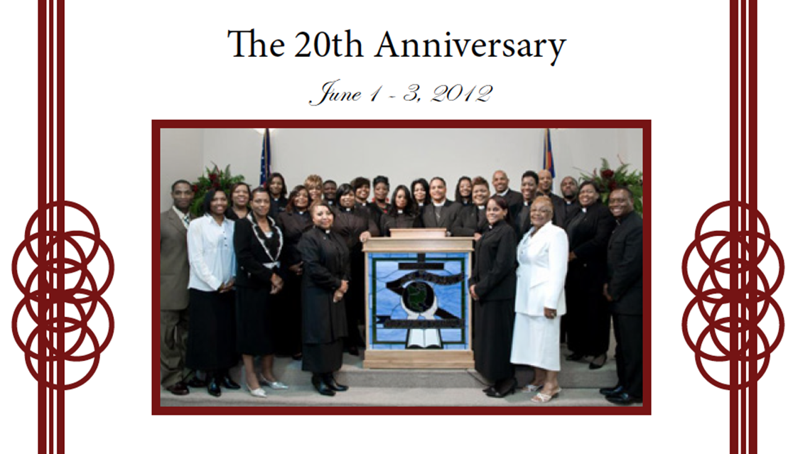 |
For DOT’s 25th anniversary, I created promotional materials for the event. I used various shades of blues and purples to have a calin effect. One prominent feature in the marketing was the leaves include. I purposefully used it as part of a olive branch. 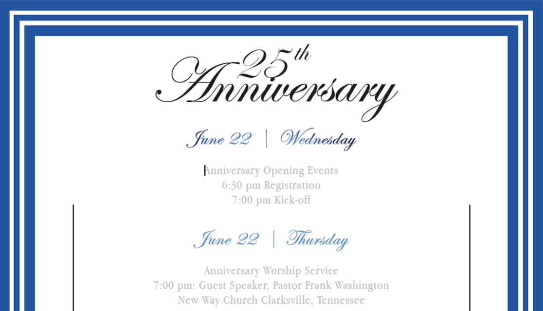 |
DOT asked me to create a flyer for their elder ordination. In some denominations, various people can be promoted to elder. They fill offices for ministering, pastors, etc. Once again, I wanted to have a peaceful effect, which is why I had various shades and tints of blues (also the use of water and clouds in the background). 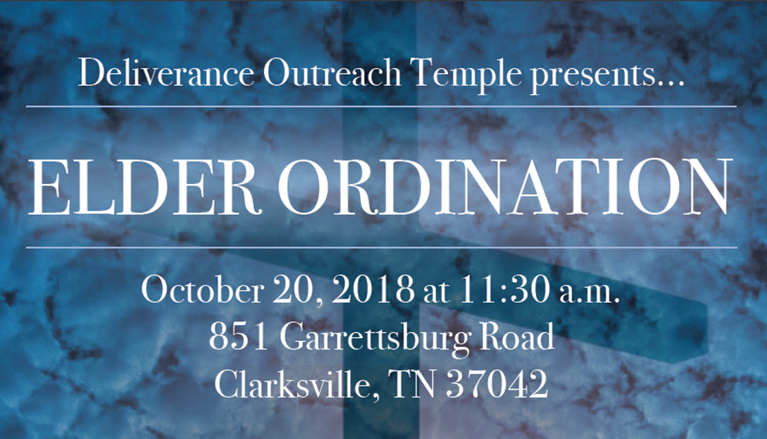 |
|
DOT asked me to create a logo for their Established Hands Ministry. It is a nonprofit food program that they created to feed people from underrepresented communities around Clarksville, TN. 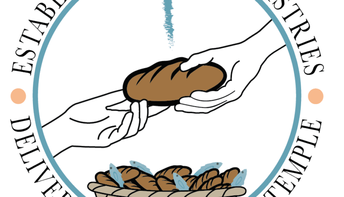 |
DOT asked me to create a logo for their Established Hands Ministry. It is a nonprofit food program that they created to feed people from underrepresented communities around Clarksville, TN.  |
I created a flyer for DOT’s 2020 NYE’s celebrations. This was for their website. It was created via PowerPoint. 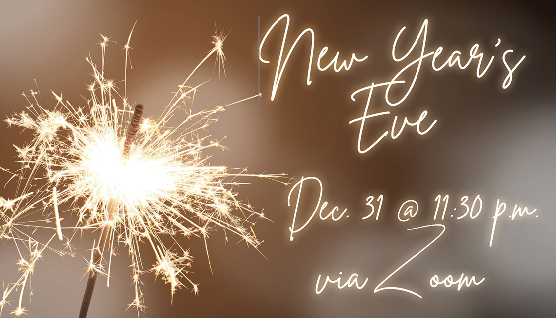 |
This flyer was created for the prayer team’s breakfast and fellowship event. Created in InDesign, it was mainly just a menu for their breakfast. 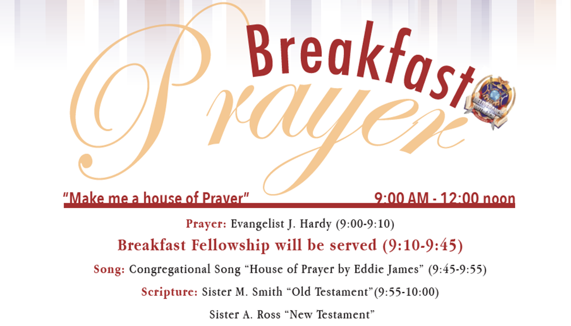 |
|
This flyer was created for the prayer team’s breakfast and fellowship event. Created in InDesign, it was mainly just a menu for their breakfast.  |
These slides were created for the landing page on DOT's website. Currently, they are not featured on the Website because there was a redesign.  |
These slides were created for the landing page on DOT's website. Currently, they are not featured on the Website because there was a redesign. 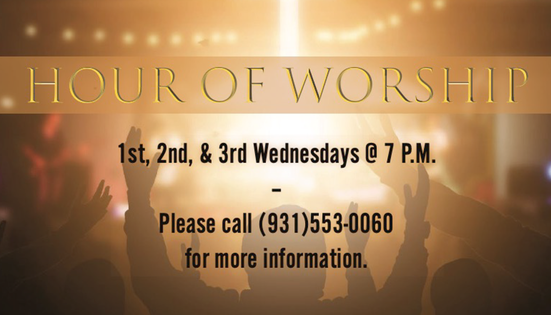 |
This flyer was create for DOT's Watch Night Service for 2019. 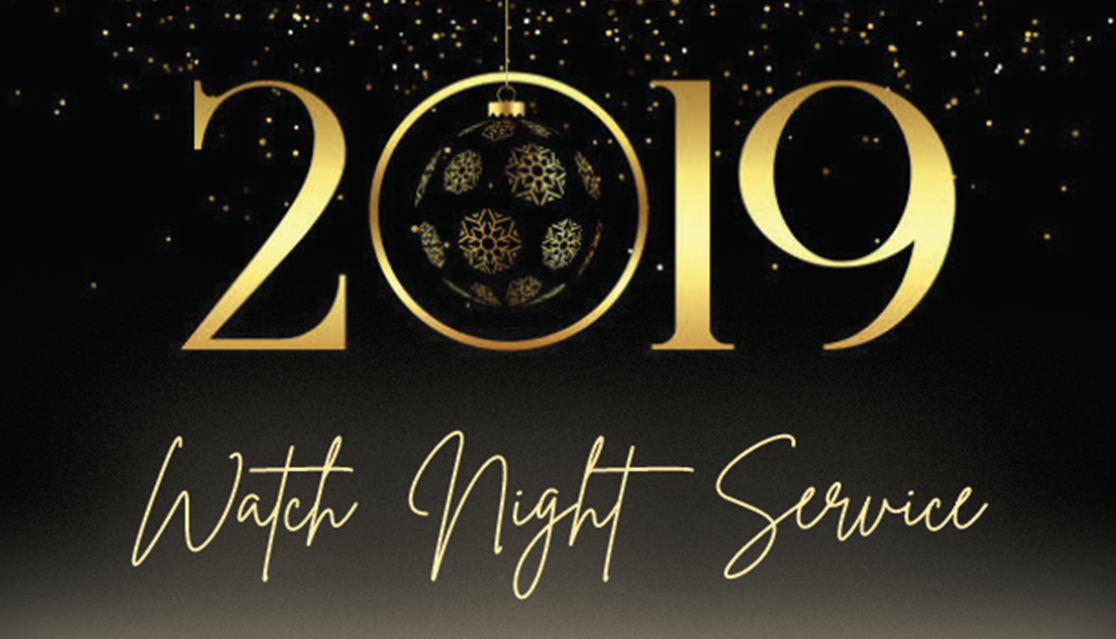 |
|
This flyer was create for DOT's Watch Night Service for 2019. 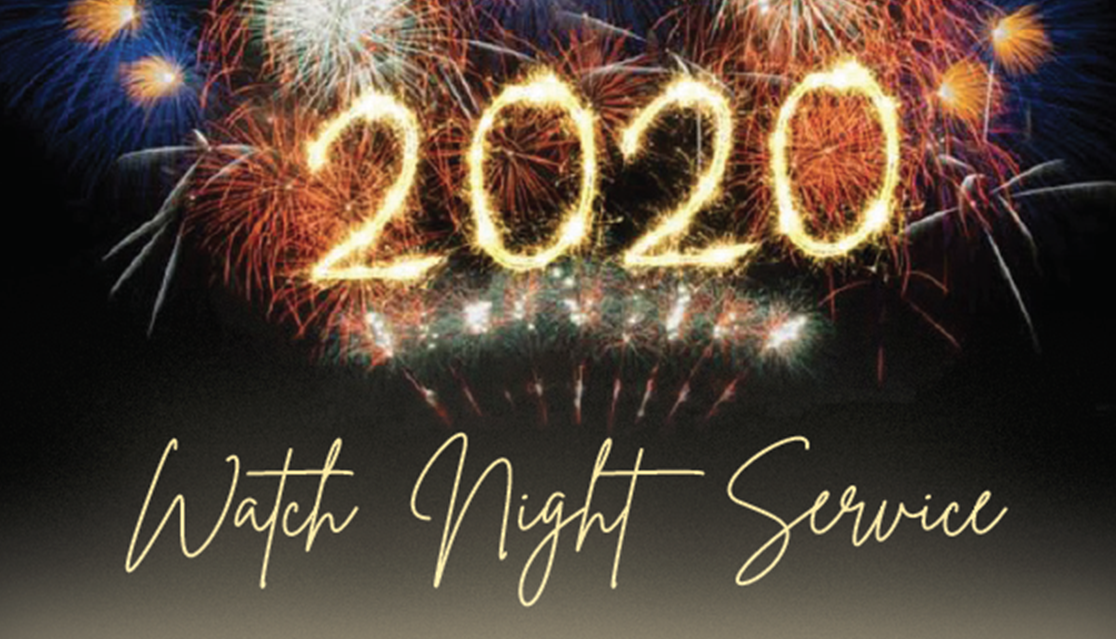 |
|||